
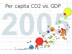
 Gapminder is an organization dedicated to helping understand the world, and particularly environmental issues, by providing interesting tools for statistical analysis. They’re well-known for their Wonderbread-like bubble charts, and brief presentations by director Hans Rosling like the one at right on CO2 emissions from their “myth demolishing series.”
See also Worldmapper.