
This blog post follows up on a post from December, 2o13.
Key Findings:
The chart below shows the total CO2 emissions from the consumption of energy and the per capita CO2 emissions of US, China and India in the years 2006 and 2011.
| Total CO2 emissions from the consumption of energy (million metric tons) 2006 | Total CO2 emissions from the consumption of energy (million metric tons)2011 | Per capita CO2 emissions (tons) 2006 | Per capita CO2 emissions (tons) 2011 | |
| US | 5823 | 5490 | 19.78 | 17.62 |
| CHINA | 6533 | 8715 | 4.58 | 6.52 |
| INDIA | 1494 | 1725 | 1.16 | 1.45 |
The study of these nations reveals various scenarios which represent diverse uses of energy. These further helps in studying the wasteful behaviors of households and identifying the measures to be taken.
The chart points towards the high CO2 emissions in both categories in a developed country like US.
The populations of developing countries such as India and China are adapting at a very fast pace toward an urban lifestyle.
From 2006 to 2011, the emissions seem to reduce in US and increase in India and China.
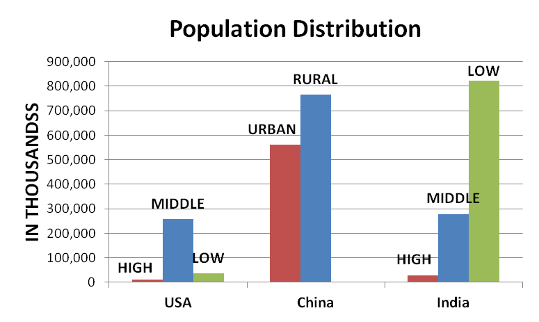
Chart above: The population breakdown compared across US, China and India. High, middle, and low refers to income groups.
Chart below: GHG emissions across the three countries.
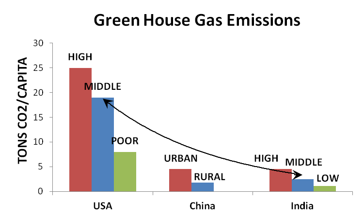
The charts above show the population distribution in US, China and India. The comparison shows:
- The high-income people have the lowest populations and the highest contribution to emissions.
- The developing countries need carbon space for the large chunk of low-income population to develop.
- The average North American generates about 20 tons of CO2-eq each year. The global average carbon footprint is about 4 tons of CO2-eq per year. (Walser, 2010)
It is easier to understand the statistics across the globe if we individually look at what creates that carbon footprint!
Following are some facts about the three countries:
India:
The findings plainly illustrate that the considerably high carbon footprint of a relatively small wealthy class (1% of the population) in the country is camouflaged by the 1.1 billion poor population of the country, who keep the overall per capita emissions below 2 tonnes of CO2 per year.
While even the richest income class in this study, earning more than 30,000 rupees a month, produce slightly less than the global average CO2 emissions of 5 tonnes, this amount already exceeds a sustainable global average CO2 emissions of 2.5 tonnes per capita that needs to be reached to limit global warming below 2 degrees centigrade.” (G. Ananthapadmanabhan, 2007)
A very small percentage of the population (high income) was actually hiding behind the 80% of the population in terms of their carbon footprint.
China:
Acknowledging the significant regional differences in China, we select five very divergent provinces as case studies, situated in the east (Shanghai), south (Guangdong), centre (Henan), north (Heilongjiang) and west (Gansu).” (Kuishuang Feng, 2009).
People’s lifestyles in rural areas of Shanghai were much different from other areas. Differences due to higher housing prices, in the case of Shanghai or higher expenditure shares on clothing in the colder regions continued to exist. The basic difference between rural and urban China: almost 3 times the carbon emissions in urban China over rural China.
It was very rare to have electrical appliances in rural China in 1985, while in 2002 coverage of electrification had increased dramatically to 32% for washing machines, 14% for refrigerators, and 60% for color TV sets.
The purchase of washing machines doubled in 2002 as compared to 1985 in urban China. Color TVs are now present in most urban households and over half of rural households.
The number of refrigerators increased by 10 times between 1985 and 1995, and climbed by another 30% between 1995 and 2002.
USA:
No distinctions made on the income group or a region since there is a large middle class which exists across the country.
Housing accounts for almost one-third of consumer-spending, while the remaining four categories, namely transport, food, goods and services are somewhat evenly split.
The expenditure is more towards housing whereas transport contributes to emissions the most.
The break-up of the end-use electricity consumption shows a large contribution of kitchen appliances (which includes vampire loads). The next in row are air-conditioning, space heating and lighting.
The chart below shows a comparison between all the three scenarios:
| USA avg. | India avg. | 3k-8k | 8k-15k | 15k-30k | China avg. | |
| Per capita emissions (million metric tons) | 911 | 142.2 | 256.3 | |||
| Typical household size | 2.6 | Urban-4.1 Rural -4.3 | Rural-4.5 Urban-3.2 | |||
| Typical household emissions (metric tons) | 2368.6 | Rural-611.46 Urban-583 | 495 | 535 | 868.5 | Rural-1153.3 Urban- 820.16 |
| Breakdown | Transport | Over 200 | 66.33 | 152.5 | 221.5 |
The chart affirms the fact that the average values of a country are elusive. What is clear is the need to find strategies to shift behavior to reduce emissions in all parts of the world, especially developed countries and those countries that are rapidly developing.
Bibliography:
G. Ananthapadmanabhan, K. S. (2007). Hiding Behind the Poor. Bangalore: Greenpeace India Society.
Kuishuang Feng, K. H. (2009). Lifestyles, technology and CO2 emissions in China: A regional comparative analysis. Elsevier , 145–154.
Walser, M. L. (2010, 07 2010). carbon footprint. Retrieved 07 25, 2010, from eoearth.org: http://www.eoearth.org/article/Carbon_footprint