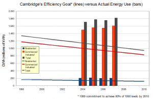
Recently, we’ve begun some efforts to analyze and map energy use data in the City, and a volunteer created this compelling graph that roughly demonstrates how far Cambridge is from meeting its goal to reduce emissions to pre-1990 levels. Of course the graph actually plots electricity use, and not emissions but the two are well correlated, and we hope to have a more complete graph of emissions including natural gas in the future.
Note: Due to limitations in the available data, energy use for some apartments is included in “Commercial.”
If you’d like to learn more about improving energy use in your home or office and receive an audit visit the Cambridge Energy Alliance.


We received a few comments about this post and would like to try to clarify:
This is correct, the goal was set in 2002, but the intent to set and adhere to goal occurred in 1999. Had we managed to start then, we’d need have only adhered to the flatter lines shown, rather than stepper ones which begin in 2002 sloping to 2010.
That is correct. It was the simplest way to create the graph, and matches some conception of “fair,” although it is not necessarily the most efficient way of achieving the desired results, nor what the City or CEA are specifically pursuing.
Correct, but barring large adoption of renewables to displace conventional fuels, they are highly correlated. See also graphs of citywide emissions based on municipal data.
Good catch, we’ve made the appropriate correction in this slightly higher quality graph: